The following are only examples of style and color and do not represent my final work.
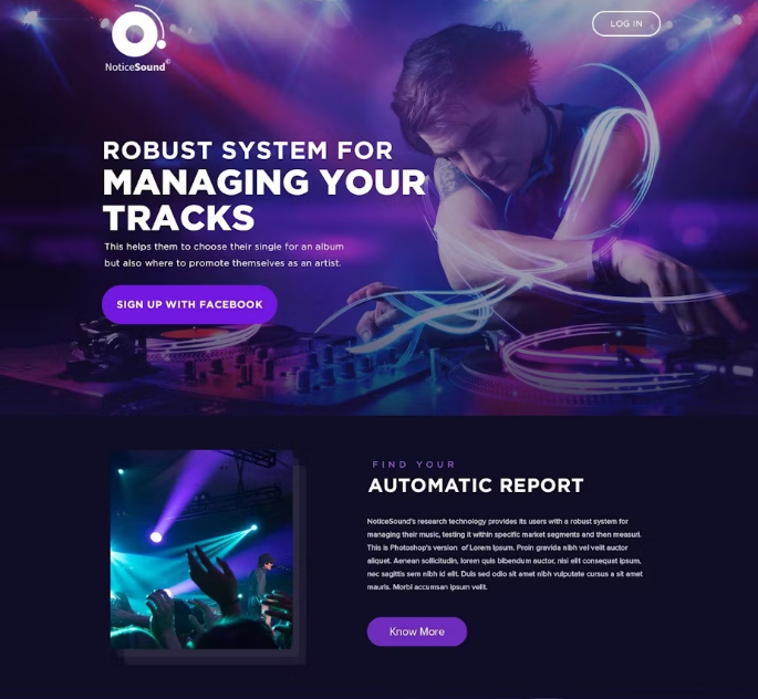
Cozy, Dark, and Minimal
                
                            Rounded corners and dark backgrounds with purples and blues create a sense of comfort and
                            coziness on websites due to a combination of psychological and aesthetic factors.
                            
                            Rounded corners are softer on the eyes compared to sharp, angular edges. They evoke a sense
                            of
                            safety and approachability, reducing the perceived harshness and rigidity that straight
                            lines
                            and corners can convey. This mimics natural shapes found in nature, like pebbles or leaves,
                            which are more likely to be rounded than sharply angular.
                            
                            Darker tones are less intense and provide a more relaxed viewing experience, especially in
                            low-light environments. This creates a calming effect, reducing eye strain, and making the
                            experience feel more intimate and less overwhelming.
                        
                            Rounded corners and smooth transitions are key elements of modern design. They give
                            interfaces
                            a more polished and user-friendly appearance. This trend in design aims to make digital
                            experiences feel more natural and less mechanical.
                            
                            Dark backgrounds with cool tones like purples and blues can create a sense of depth, making
                            the
                            interface feel more immersive. This, coupled with the visual softness of rounded corners,
                            enhances the overall user experience by making the digital space feel more tangible and
                            enveloping.
                            
                            Dark backgrounds naturally draw attention to lighter elements, such as text and interactive
                            components. This contrast helps users focus on content without feeling overwhelmed by
                            bright,
                            harsh environments. Rounded elements also guide the eye smoothly from one part of the
                            interface
                            to
                            another.
                        
                Bright, Clean, and Inviting
                
                            Light themes, typically featuring white or light-colored backgrounds, offer high contrast
                            with dark text, improving readability. This clarity is particularly beneficial for
                            content-heavy websites like blogs, news sites, or e-commerce platforms where users need to
                            easily read and digest information.
                            
                            Light themes create a sense of openness and simplicity. The use of white space makes the
                            design feel airy and uncluttered, helping users focus on the content without being
                            distracted by the background.
                            
                            Light colors are associated with positivity, energy, and cleanliness. They evoke feelings of
                            optimism and freshness, which can enhance the user’s mood and create a welcoming atmosphere.
                        
                            Light backgrounds allow colorful or bold elements like CTAs to stand out more prominently.
                            Rounded buttons or boxes draw attention without being overly aggressive, making users more
                            likely to interact with them.
                            
                            Light themes with rounded corners can be easily adapted to various design styles, whether
                            minimalist, corporate, or playful.
                        
                Professional, Precise, and Impactful
                
                            Sharp designs often feature a polished, well-organized appearance that exudes
                            professionalism. This can help establish credibility with clients, customers, and partners.
                            
                            A sharp design ensures that information is presented in a clear and concise manner. This
                            direct approach reduces confusion and helps convey your message effectively.
                            
                            Sharp designs usually adhere to a strict visual consistency, with a well-defined color
                            palette, typography, and layout.
                            
                            Sharp designs prioritize functionality and ease of use, with intuitive navigation and a
                            logical flow of information. This can lead to better user experiences, where visitors can
                            quickly find what they need.
                        
                            Sharp business sites often use clean, neutral backgrounds to create a professional and
                            uncluttered appearance. This allows primary elements like headings and key information to
                            stand out clearly.
                            
                            Neutral or subtle backgrounds make bold colors and precise elements, such as buttons and
                            graphics, more prominent. This contrast ensures that important features, like calls to
                            action (CTAs), are highly visible and effectively drive user interaction.